Today, we're zeroing in on five major index ETFs, analyzing their performance as of the close of trading on Thursday, May 29th.
To truly enhance your viewing experience, we've compiled all the accompanying slides right here. Think of them as your visual roadmap, especially if you're tuning in on a mobile device.
This user guide is limited to helping subscribers interpret the data we share, but investors should understand the risks inherent to trading .Use StockCheatSheets as a starting point for your own research and not a recommendation to buy and sell securities
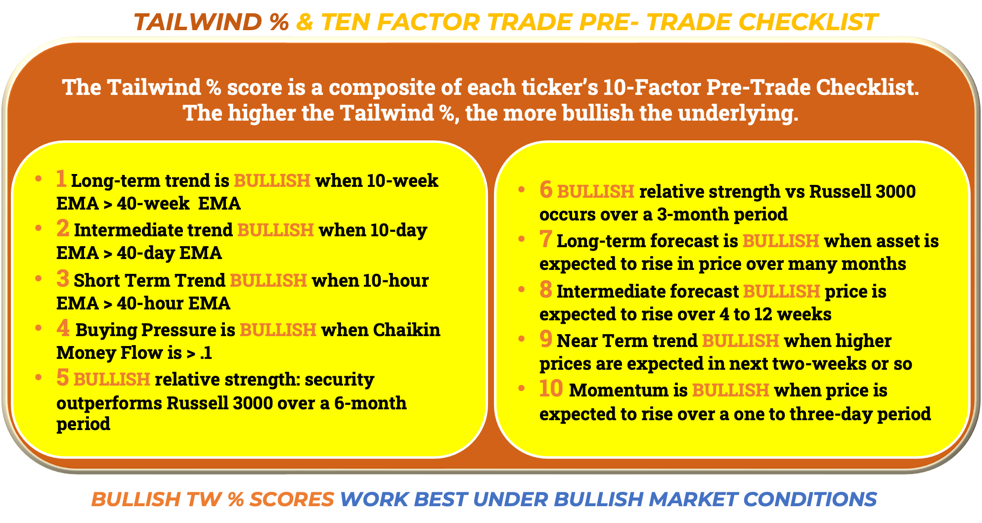
For our newer subscribers, consider this session a confidence booster. We know that sometimes, our data might be overwhelming or tell a different story than the prevailing market narrative. That's okay! Our goal is to equip you with the insights to navigate those moments with conviction with minimal emotion. This video offers a deeper look into the metrics that power our ETF and stock rating models, the very same ones that underpin our popular QuickView Charts. You'll find our presentation graphics a bit "dumbed down" for clarity, boiling down crucial metrics into a simple, easy-to-digest "green is good, red is bad" format—perfect for bullish intermediate trend following and simply presented without shying away from the underlying complexity.
Green Zone Trades Have a 70% Win Rate in Our Experience.
But which metrics combine for optimal green zone moves? It’s a combination of multi-week price momentum and money flow. Red zones are a great time for selling calls or implementing other hedges, but not necessarily consistently profitable “shorting” opportunities. In the video, we’ll spend time on these key parameters.
What's Else Is In It For You?
This video is an excellent jumping-off point for your own market research. You'll gain a clearer understanding of our system and become more comfortable with our unique shorthand. We're committed to making more videos, as there's always more to uncover than any single edition of our Cheat Sheets blog can explain comprehensively. Over time, as you become acclimated to our nomenclature and 10-factor technical modeling, you'll unlock exponentially greater knowledge through a deeper understanding.
Specifically, you'll uncover:
Actionable ideas for how to interpret our data. For instance, knowing when to add hedges, when to press risk, and when a pullback is more likely to trigger bearish contagion from shorter to longer timeframes.
A better grasp of how our Tailwind % and color-coded charts can sharpen your entry and exit timing, along with your overall risk management.
An enhanced understanding of how our four market forecast timeframes interact. When combined with buying pressure, they form a reliable package of leading indicators, helping intermediate timeframe trend followers catch trends earlier without taking on disproportionately equivalent risk.
What This Video Isn't
It's not a divining rod or a crystal ball, magically predicting every market turn.
It's not insurance against a sudden market-moving tweet, rumor, or headline that pushes a trade against you.
It's not a one-and-done instruction manual. Trading is a lifelong educational journey.
We genuinely hope our analysis helps you become incrementally better. Remember, if you can outperform benchmark indexes by just a percentage point or two—by minimizing mistakes that lead to losses and generating rewards that are larger than incurred losses—your account will compound on a fast track and leave most undisciplined investors in the dust.
We're confident this session will add significant value to your market insights. So why not subscribe? We have free and paid editions. We don’t a charge for what we promise to deliver week


Share this post